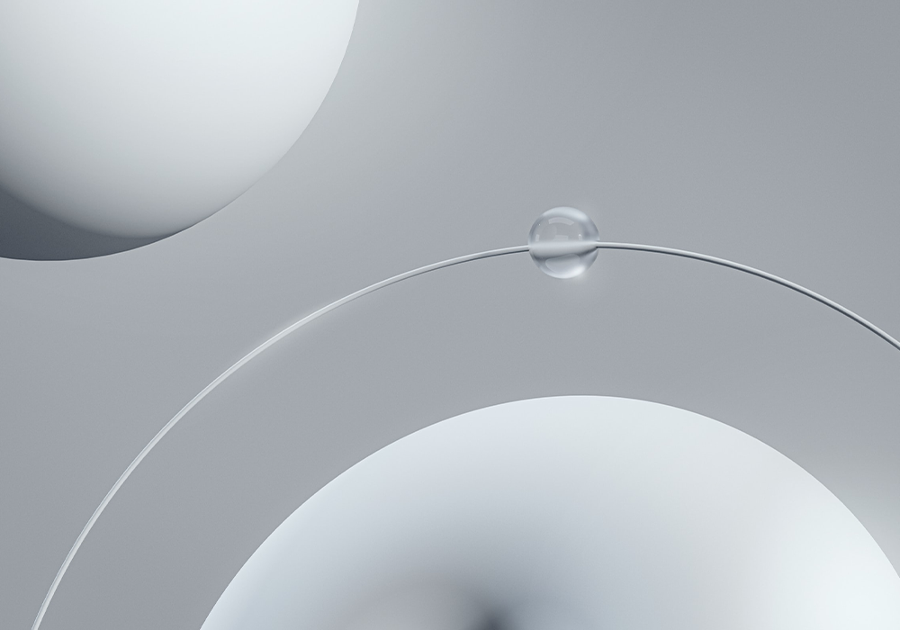
Less is More
Are you tired of cluttered designs that overwhelm your audience? Do you want to create designs that effectively communicate your message without sacrificing aesthetics? Then it's time to embrace the philosophy of "graphic design, less is more." In this article, we'll explore the power of minimalism in design and how you can apply it to your own work.
The Philosophy of Less is More in Graphic Design
"Less is more" is a well-known phrase that originated from the architect Ludwig Mies van der Rohe. It is a design philosophy that advocates for simplicity, minimalism, and the removal of anything that is unnecessary. When applied to graphic design, this philosophy emphasizes the use of negative space, simple typography, and a limited color palette to create designs that are clean, clear, and effective.
In today's fast-paced world, where attention spans are short and distractions are abundant, minimalism in design is more important than ever. By using fewer elements and simplifying the design, you can create a visual hierarchy that guides the viewer's eyes and directs their attention to the most important elements. This, in turn, can increase the impact and effectiveness of your message.
So, how can you apply the philosophy of "graphic design, less is more" to your own work? Let's explore some tips and techniques.
Tips and Techniques for Embracing Minimalism in Design
1. Start with a Clear Message
Before you start designing, it's essential to have a clear understanding of your message and what you want to communicate. When you know your message, you can focus on creating a design that supports and enhances that message, rather than distracting from it.
2. Use Negative Space
Negative space, also known as white space, is the area around and between the elements in a design. By using negative space effectively, you can create a visual balance and enhance the overall composition. Negative space can also help to create a sense of focus and guide the viewer's eyes to the most important elements in the design.
3. Simplify the Typography
When it comes to typography, less is often more. Instead of using multiple fonts and styles, stick to a simple and consistent typography system. Use typography to create contrast and hierarchy, and make sure that the typography supports the message rather than distracting from it.
4. Limit the Color Palette
A limited color palette can be a powerful tool in minimalistic design. By using only a few carefully chosen colors, you can create a cohesive and harmonious design that is easy on the eyes. This can also help to create contrast and emphasis, guiding the viewer's eyes to the most important elements in the design.
5. Remove Unnecessary Elements
One of the key principles of minimalism in design is the removal of anything that is unnecessary. When designing, ask yourself if each element is essential to the message you want to communicate. If not, consider removing it. This can help to simplify the design and create a stronger visual impact.
FAQs
Q.Is minimalism in design only suitable for certain types of design?
A.No, minimalism can be applied to any type of design, from logos and branding to websites and packaging.
Q.Is it possible for a minimalistic design to be too simple?
A.Yes, it's possible to oversimplify a design to the point where it becomes ineffective. It's essential to find the right balance between simplicity and functionality.
Q.Is minimalism in design a trend or a timeless principle?
A.While minimalism has been a design trend for decades, it is also a timeless principle that has been applied.
